
The Problem
Users had to dig through multiple pages and reports to find what mattered - goals, offers, and next steps were buried deep, leading to confusion and inaction.
The Approach
I introduced a modular widget system on the homepage - surfacing business goals, offer summaries, and urgent actions at a glance.
Instead of overhauling the entire page, I designed scalable components that could flex across teams and partner use cases.
Key Solutions
My goal: Bring key insights to the forefront without overwhelming users.
I proposed introducing lightweight, dynamic widgets that would:
Instantly surface progress towards Marketplace goals
Summarize the status of critical offers
Guide users toward urgent actions without needing manual search
Working closely with product managers and engineers, I designed a system of three key widgets - each solving a different piece of the puzzle.
Problem Discovery
Research and user interviews revealed two things:
Many ignored the homepage completely because users felt that the homepage wasn't giving them clear or useful information.
Others spent too long hunting for insights - digging up insights took a user a minimum of 4-5 clicks. Partner managers were overwhelmed. Instead of quick wins, they faced a clutter of links and tabs
The fix? Don’t just show numbers - guide decisions.
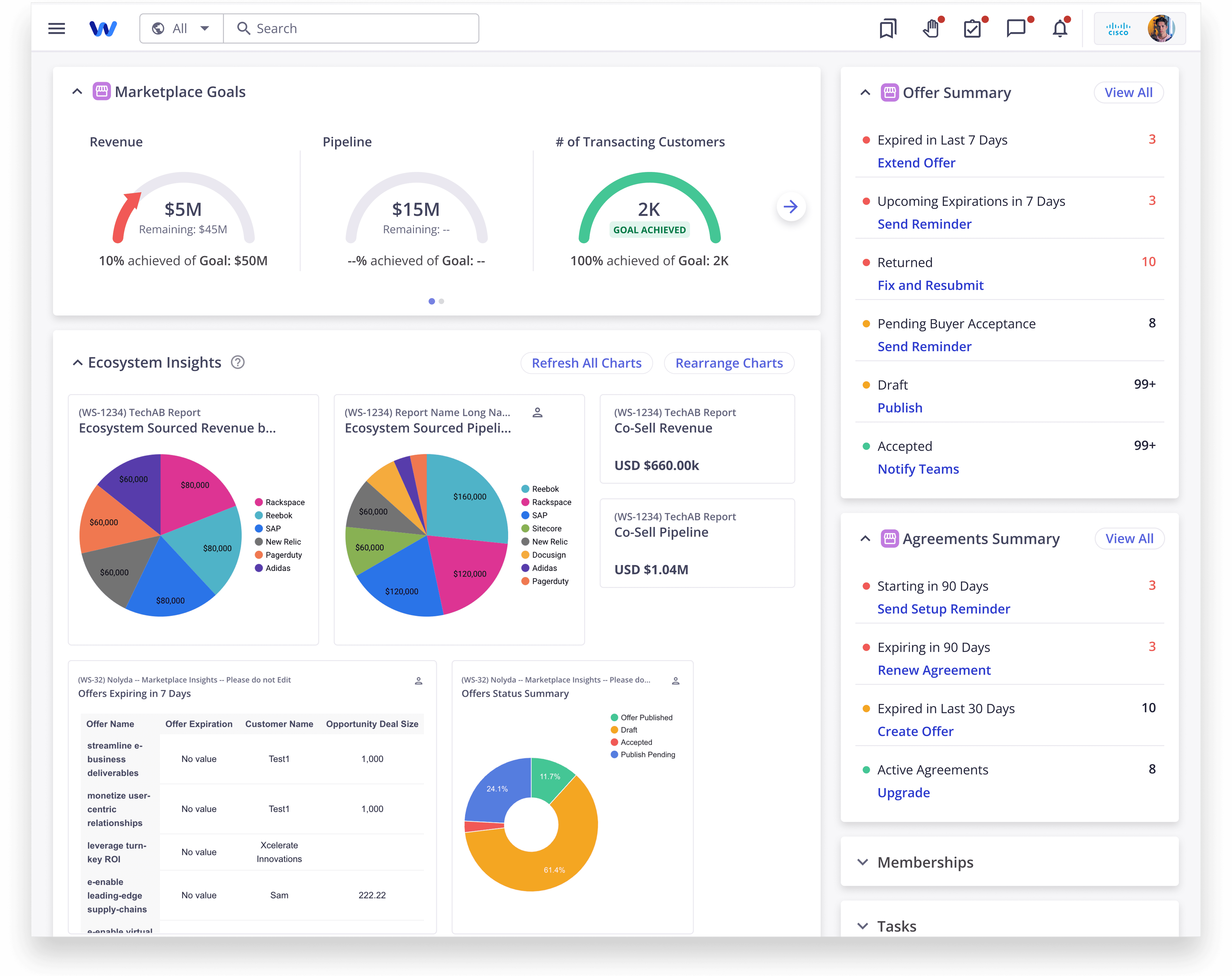
Widget #1: Marketplace Goals Widget
Your business at a glance
The heartbeat of the Marketplace - showing goal progress, offer statuses, and key targets at a glance.
Power users called this their "morning dashboard."
Widget #2& #3: Offer & Agreement Summary Widgets
Tracking Offers and Taking Action - All in One Place.
The Offer & Agreement Summary widget condensed a complex offer pipeline into a clear visual snapshot - helping teams quickly monitor offers by stage and priority without opening multiple tabs.
Users not only tracked offer health but also immediately saw the next steps they needed to take - like expiring offers, pending approvals, and urgent tasks - all surfaced automatically when they logged in.
Snapshots of the Widgets

Goals Summary Widget
At-a-glance performance overview


Offers & Agreements Tracker
Workflow visibility with clear CTAs, urgency and priority indicators.
Impact
Launching the widgetized dashboard didn’t just clean up the interface — it changed user behavior:
Users accessed critical insights 2x faster than before
Marketplace page engagement increased by +28% post-widget launch
Power users showed a higher task completion rate without needing external reports
By surfacing the right information at the right time, we made the platform stickier, smarter, and easier to navigate.
The Final Outcome
Scalability
The widget-based redesign didn’t just improve WorkSpan’s Marketplace app.
In 2025, one of our customers, Cisco, adopted the same design principles for their Partner Incentives Portal - a custom landing page on WorkSpan that supports tens of thousands of users across partner organizations through this global-scale initiative.
Partners needed a simpler way to track and claim funds across multiple allocation types - marketing, sales, events, and more.
Using the same modular widget approach, I helped redesign Cisco’s landing page to deliver a 360° view of allocations, deadlines, and approvals - all in one place.

Cisco Partners' Landing Page on WorkSpan
What This Project Taught Me
Critical insights shouldn’t require critical effort. Surfacing matters just as much as designing beautifully.
Real-world usage always surprises you. Early testing with power users helped refine prioritization and interaction patterns.
Atomic design works. Modular widgets allowed us to be flexible, extensible, and user-driven - not locked into rigid page layouts.
It’s one thing to redesign a homepage.
It’s another to design a daily habit.